

The fastest way to improve contact form conversion is to strip your form down to what’s truly necessary, rewrite the button so it promises an outcome instead of an action, and instrument every field so you know exactly where people quit. Most contact forms convert somewhere between 1% and 3% of visitors, with 5% or higher counting as strong performance. Get the fixes below in the right order, and you’ll usually see movement within a few weeks.
TL;DR:
- Reducing form fields to only essential information can boost conversion rates by up to 120 percent, especially when trimming long forms from 11 to 4 fields.
- Replacing generic “Submit” buttons with outcome-specific labels like “Get My Free Quote” significantly improves click-through and submission rates.
- Prioritizing mobile-friendly design with single-column layouts, proper touch targets, and clear labels enhances usability on devices where over half of traffic originates.
- Server-side validation, reliable data storage before email notifications, and minimal spam defenses like honeypots are critical to maintaining form integrity and preventing lead loss.
Table of Contents
- Priority Checklist for Contact Form Conversion
- Mobile and Accessibility Details That Protect Conversions
- Server-Side Reliability, Storage, and Spam Protection
- Measuring Contact Form Conversion the Right Way
- Testing and Iteration: What to Change First
- Copy and Trust Signals That Reduce Hesitation
- Single-Step vs. Multi-Step Forms
- Thank-You Pages and Follow-Up That Close the Loop
- Envision Marketing Agency’s Audit-to-Optimization Approach
- What I Prioritize First in a Form Audit
- How Envision Marketing Agency Can Help Turn Visitors Into Leads
- Sources
Priority Checklist for Contact Form Conversion
Not every fix carries the same weight. Some changes take ten minutes and move the needle immediately; others matter but rank lower on the list. Work through these roughly in order.
- Cut every field that isn’t essential. Name, email, and message cover most use cases. If you’re capturing simple inquiries, an email-only form works fine. Case studies on form redesigns show that trimming a form from 11 fields down to 4 produced conversion lifts as large as 120% in some tests.
- Kill the word “Submit.” It tells the visitor nothing about what happens next. Replace it with something outcome-specific: “Get My Free Quote,” “Send My Message,” or “Request a Callback.” The button should also stand out visually, not blend into the surrounding design.
- Pick phone or email, not both. Asking for two contact methods when you only need one adds friction for no real benefit. If you genuinely need deeper qualification data, use conditional logic to reveal extra fields only when relevant.
- Validate inline, not after submission. Flag errors as the user types or moves to the next field. Never wipe out everything they’ve typed because one field failed. This single change alone has been linked to abandonment drops of roughly mid-teens percentage points in tested forms.
- Put the form where people can actually find it. On desktop that usually means above the fold. On mobile, one scroll away is the realistic bar. Burying your form under three sections of marketing copy costs you visitors who never scroll that far.
- Drop the visible CAPTCHA if you don’t need it. Puzzle CAPTCHAs and “click all the traffic lights” tests annoy real visitors more than they stop bots. Server-side defenses (covered in the next section) usually do the job without any friction at all.
- Store the submission before you try to send a notification email. If your email service hiccups, you don’t want to lose a lead because the notification failed and nothing was saved. Persisting the record first, then attempting delivery, protects you from silent data loss.
- Add one line about privacy and one about response time near the button. Something like “We respond within one business day. Your information stays private.” costs you a sentence and buys real reassurance at the exact moment someone hesitates.
- Track field-level events, not just overall submissions. Focus, blur, validation failure, and submit events on each field tell you which one is bleeding visitors. Aggregate conversion rate alone hides this.
- Watch a handful of session replays every month. Watching real visitors interact with your form surfaces problems no analytics dashboard shows on its own, including confusing labels or fields that visually break on certain devices.
- Test one variable at a time, starting with field count. Changing the CTA copy and the layout in the same test tells you nothing about which change actually worked. Field count tends to produce the biggest single lift, so start there.
- Recheck the whole form after every major site redesign. A new theme or page builder update can silently break autofill, validation, or mobile layout without anyone noticing until submissions drop.
None of these fixes require a development sprint. Most are copy edits, a CSS tweak, or a backend configuration change you can ship this week.
Mobile and Accessibility Details That Protect Conversions
More than half of form traffic on most sites now comes from phones, and a form that works fine on desktop can quietly fail on mobile. A few structural choices make the biggest difference:
- Use a single-column layout. Multi-column forms force awkward thumb movement and visually confuse the tab order on small screens.
- Make touch targets at least 48 pixels tall. Anything smaller causes mis-taps, especially on inputs stacked close together.
- Put labels above each field, not inside it as a placeholder. Placeholder-only labels vanish the moment someone starts typing, and screen readers often skip them entirely.
- Set the right input attributes:
type="email"triggers the email keyboard,autocomplete="name"speeds up repeat visitors, andinputmode="numeric"helps for phone numbers. - Keep keyboard focus visible at all times. If a user tabs through your form and can’t tell which field is active, that’s an accessibility failure, not just a cosmetic one.
- Make error messages visible without scrolling, and describe the actual problem instead of a generic “Invalid input.”
- Test with a real screen reader, not just a browser’s accessibility audit tool. VoiceOver and NVDA both expose issues that automated checkers miss.
Run your form through an actual phone, not just a resized browser window, before calling it done.
Server-Side Reliability, Storage, and Spam Protection
Client-side validation makes your form feel responsive, but it does nothing to protect you from a bad actor or a broken browser. OWASP’s input validation guidance is explicit on this point: every rule enforced in JavaScript needs a matching check on the server, because client-side rules can be bypassed entirely.
A few backend practices prevent the most common failure modes:
- Re-validate every field server-side, even ones that already passed client-side checks.
- Save the submission to your database or storage system first, then attempt to send the notification email. If the email step fails, the lead still exists somewhere.
- Build in retry logic for failed email delivery instead of letting a single failed send silently drop a lead.
- Use a honeypot field, a time-trap (rejecting submissions completed in under two seconds), and per-IP rate limiting as your first line of spam defense. Together, these three methods stop most bot traffic without a visible CAPTCHA.
- Reserve CAPTCHA for forms getting hit hard despite the above, and even then use an invisible version rather than a puzzle.
- Weigh hosted form backends against a self-hosted serverless endpoint paired with a transactional email API. Hosted tools move faster; a custom endpoint gives you more control over storage and retry behavior.
Pro Tip: Log every rejected submission attempt, even spam. A spike in rejected attempts from a single IP range is often the first sign something in your form logic broke, not just a bot problem.
Measuring Contact Form Conversion the Right Way
Pick one denominator, either unique visitors or pageviews, and use it consistently every time you calculate conversion rate. Switching between the two mid-analysis makes month-over-month comparisons meaningless.
Most contact forms convert 1% to 3% of visitors, and a form hitting 5% or better is performing well. Treat those numbers as a general reference point, not a target every form must hit. Vertical, traffic source, and page intent all shift what “good” looks like for your specific form.
Beyond the top-line number, track:
- Focus and blur events on each individual field, so you know exactly where attention drops off.
- Validation failures per field. A field that trips errors constantly is usually the real conversion leak, not the form as a whole.
- Partial submissions, captured where your privacy policy and local regulations allow it.
- Session replay footage for a sample of visits. Watching actual behavior often reveals a UI problem, like a field hidden behind a sticky header, that no funnel report would ever surface.
Combine funnel data with replay footage and you’ll usually find that one specific field or interaction accounts for most of your abandonment, rather than a vague, evenly-spread problem across the whole form.
Testing and Iteration: What to Change First
Random testing wastes traffic. Work through changes in order of expected impact:
- Field count first. This produces the largest single lift in most cases, so test it before anything else.
- CTA copy second. Once the form itself is lean, test button wording and framing.
- Placement and visual prominence third. Move the form higher on the page or make the button more visually distinct.
- Microcopy last. Small wording tweaks near the form matter, but they produce smaller gains than the changes above.
Change one variable per test. If your traffic volume is low, extend the test duration instead of running multiple variants simultaneously, since a longer single-variable test beats a noisy multi-variable one. Aim for at least 100 conversions per variant before calling a result, and let tests run for a minimum of one to two weeks to smooth out day-of-week effects. Finally, don’t stop at conversion rate. Track how many of those submissions turn into qualified leads or actual sales. A form that converts more often but pulls in lower-quality inquiries hasn’t actually solved your problem.
Copy and Trust Signals That Reduce Hesitation
The words around your form matter almost as much as the fields inside it. A button that says “Start My Project” or “Get a Free Estimate” tells the visitor exactly what they’re getting; “Submit” tells them nothing.
- Pair the CTA with a short response-time promise: “We’ll reply within one business day.”
- Add a one-line privacy note directly under the button, not buried in a footer link.
- Keep social proof subtle at the point of commitment. A small client logo strip works; a full testimonial carousel next to the form usually distracts more than it reassures.
- Be specific about what happens after the click: who responds, roughly when, and through what channel. Vague confirmation copy leaves people wondering if the form even worked.
Good landing page copy built around a specific outcome, paired with a form that asks for almost nothing, consistently outperforms polished design with generic wording.
Single-Step vs. Multi-Step Forms
The rule of thumb is simple: use a single-step form for 1 to 5 fields, and switch to multi-step once you’re asking for 6 or more, especially when qualification logic is involved. Multi-step forms tend to outperform long single-page forms once the field count climbs, because breaking the process into visible chunks feels less demanding than one long list.
- Start multi-step forms with the easiest questions, and save anything sensitive (budget, phone number) for later steps.
- Show a progress indicator so users know how much is left.
- Use conditional branching so a visitor only sees fields relevant to their answers, rather than a static list that ignores what they’ve already told you.
Progressive profiling lets you collect deeper qualification data over multiple touches instead of forcing it all into the first interaction.
Thank-You Pages and Follow-Up That Close the Loop
A form submission isn’t the finish line. What happens in the next sixty seconds often determines whether that lead actually converts into business.
- Show an immediate confirmation page that restates your response-time promise and offers a next step, a resource download or a QR code CTA and landing page that converts works well.
- Send an automated confirmation email with a clear subject line, a quick recap of what was submitted, and what happens next.
- Route leads automatically to the right team member based on their answers, rather than dumping everything into one shared inbox.
- Track engagement on the thank-you page itself. If people click through to a resource or booking link, that’s a second conversion signal worth measuring.
Automated email follow-up sequences that trigger the moment a form is submitted keep momentum going while the inquiry is still top of mind.
Envision Marketing Agency’s Audit-to-Optimization Approach

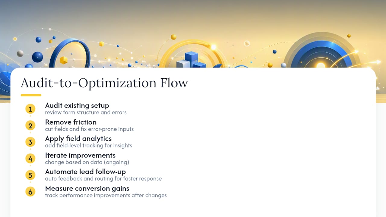
Envisionmarketingagency runs a consistent process across client forms: audit the existing setup, strip out unnecessary friction, layer in field-level analytics, then iterate based on what the data actually shows, followed by automated follow-up so no lead sits idle. Clients typically see improved form performance once fields are cut and error-prone inputs get fixed, paired with faster lead response through automated feedback and routing systems. The workflow treats the form as a living part of the site, not a one-time setup.
What I Prioritize First in a Form Audit
When I audit a contact form, three things get fixed before anything else: field count, CTA wording, and whether errors wipe out what the user already typed. Those three changes alone usually account for most of the recoverable conversion loss I see.
Volume and quality pull in different directions, so I weigh them against the business, not a generic rule. A law firm wants fewer, better-qualified leads; an e-commerce support form wants speed above all else. Pull up your own form right now and ask which of the twelve checklist items you’re actually missing. Odds are it’s more than one.
— Marcus
How Envision Marketing Agency Can Help Turn Visitors Into Leads
If your form is losing people and you don’t have the internal bandwidth to audit it field by field, that’s exactly the gap Envisionmarketingagency fills. Instead of a one-off template swap, you get a custom-built form backed by real analytics instrumentation, tied to a site actually designed to convert rather than just look good.
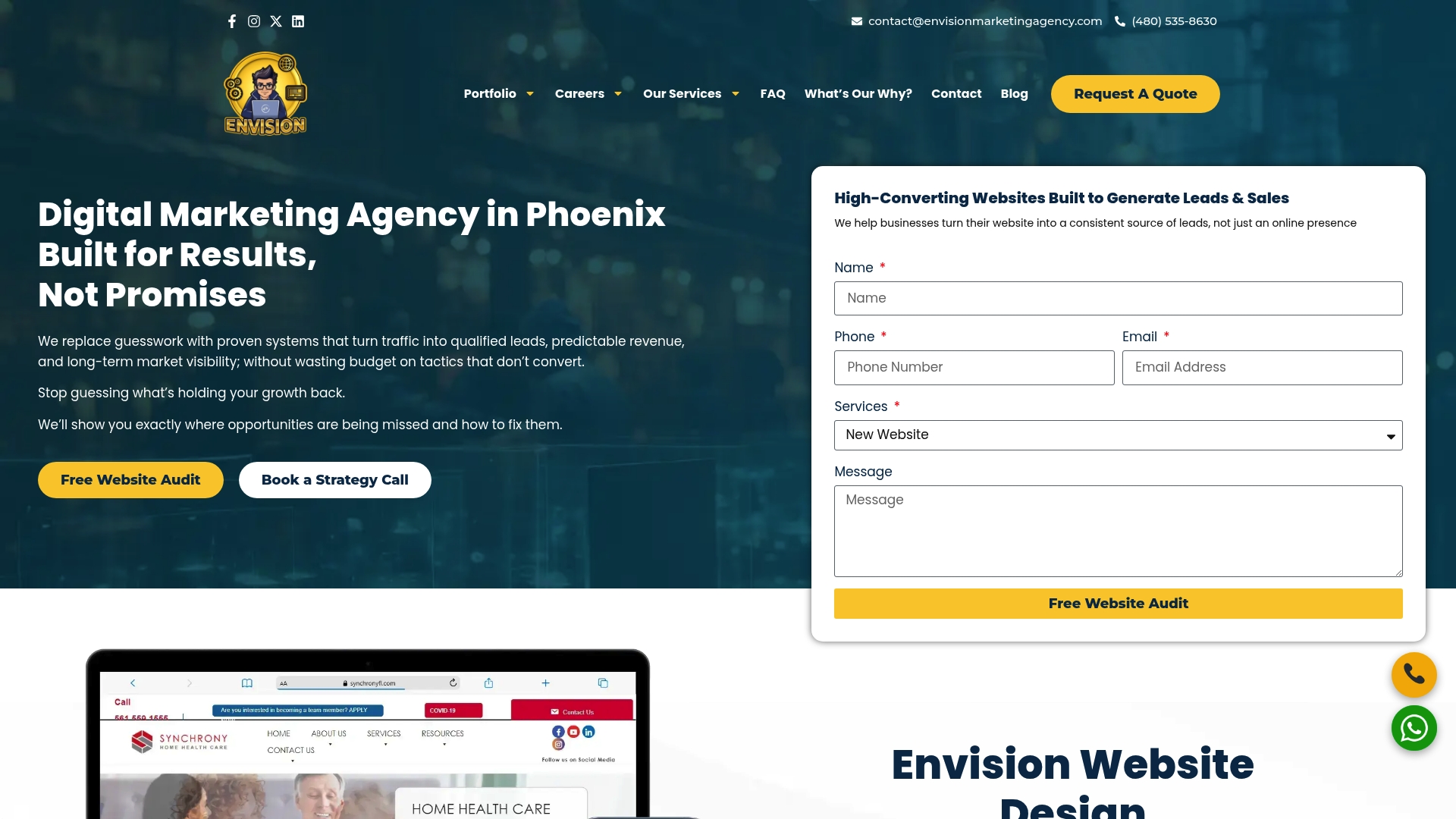
A discovery audit typically covers your current field count, CTA copy, mobile behavior, and backend reliability, then maps out which fixes will move the needle fastest for your specific traffic. From there, Envisionmarketingagency can rebuild the form as part of a full custom website design built around lead generation, with tracking and follow-up automation wired in from day one. If you’re ready to see what’s actually costing you submissions, request a mini-audit and get a concrete list of fixes ranked by expected impact.
Sources
- Form abandonment — FullStory blog
- Contact form conversion rate: benchmarks and 12 fixes — SplitForms
- Contact form optimization: 9 fixes that actually convert — CloseTrace
- Input Validation Cheat Sheet — OWASP
- The complete guide to contact forms for developers — Formtorch blog